
Killer Patterns – In this eBook are several patterns which produce great trading signals/ trading opportunities for
trading stocks, futures, FOREX and so on especially when two or more of these patterns occur at once in the same time frame or in more than one time frame.All jargon or terms like this are explained later so that identifying and using these killer patterns is extremely easy.
Entering a **short trade** based on three sell signals would be a no-brainer, especially if one of these sell signals was the one shown on page 19.[[Entering a short trade means selling to start with, without having bought anything first – and this is also known as selling to open a position. The opposite is entering a long trade, which means buying to start with, without having sold anything first – and this is also known as buying to open a position.Furthermore, the longer the time frame that the patterns occur in the longer the move is likely to be — either up or down. So patterns noticed on the weekly charts will produce bigger moves than patterns noticed on the daily charts. Also, signals in longer time frames are more reliable than signals given in shorter time frames.
A histogram is a bar chart.This indicator is one of the best and it shows whether **bulls or bears** are controlling prices and whether they are growing stronger or weaker. These signals are very easy to read too.[[Bulls believe that prices will rise -– so they buy to start with and bears believe that prices will fall — so they sell to start with.]]
The slope of the MACD histogram is more important than whether or not it is above or below the centre line.
An upward sloping MACD histogram shows that the bulls are becoming stronger. It follows that a downward sloping MACD histogram shows that the bears are getting stronger.The price trend (up or down) is likely to continue
when the slope of the MACD histogram moves in the same direction as prices.The price trend is put in jeopardy though ie there is more risk of it changing when the slope of the MACD histogram moves in the opposite direction to
prices. You should trade in the direction of the slope of the MACD histogram.The best buy signals are given when the MACD histogram is below the centre line and its slope then turns upwards showing that the bears are tired. And these signals are backed up and become extremely strong when there is a **bullish divergence.**
It follows that the best sell signals are created when MACD histogram is above the centre line and its slope turns so that it is downwards. This shows that the bulls have become tired. These sell signals are backed up and become extremely strong when there is a **bearish divergence.** So there are two main types of signals given by MACD histograms. 1) The first type is just based on the direction of the slope of the histogram from
one bar to the next.If the slope is down (meaning that the most recent bar is lower than the one before it) it shows that the bears are in control and you should be short.2) The second type is MACD Histogram Divergences -–both bearish and bullish.
1) How to Trade Using The Slope of The MACD Histogram
This quick explanation is shown before the term is mentioned below: A stop or stop-loss helps to protect your capital. If you have initially sold (gone short) your initial stop-loss will be an order that you place to buy to close your trade at
a price which is above the price at which you initially sold.Go short as soon as the histogram stops getting higher and instead ticks down (moves down). Your initial stop should be placed above the last minor high in prices. If prices fall, this stop should then be moved down to lock in paper profits so that it’s placed just above the highest price level for the last two bars.
This should be a trailing stop — meaning that as the price drops, your stop follows the price and moves down, but if prices start to rise, your stop doesn’t move.Go long as soon as the histogram stops going lower and ticks upwards instead. Your initial stop should be placed below the last minor low in prices. If prices rise, this stop should then be moved up to lock in paper profits so that it is placed just below the lowest price level for the last two bars.
It’s important to know that signals from the slope of the MACD histogram are more worthwhile on weekly charts and on charts of a longer time frame. There are just too many moves up and down on the daily charts and on the charts of even shorter time frames to be useful.
Also these signals definitely need confirmation from other signals and in as many time frames as possible, because on their own they’re not extremely strong.You should know that MACD histogram confirms (backs up) price trends when they both reach new lows at the same time or when they both reach new highs at the same time.So when there have been new lows in this indicator and new lows in prices at the same time you can expect prices to continue to fall.
It follows that when there have been new highs in the MACD histogram and new highs in prices at the same time you can expect prices to move even higher.And even when there are new lows in this indicator without new lows in prices at the same time you can still expect even lower prices in the near future.This type of signal is even stronger when MACD histogram has reached its lowest level for the past three or four months.It makes sense then that when there are new highs in this indicator even without new highs in prices at the same time you can still expect even higher prices in the near future. Again, this signal is very strong when MACD histogram has reached its highest level for three or four months.
2) How to Trade Based on MACD Histogram Divergences
Now we’ll move onto the strongest MACD histogram signals and some of the strongest signals in technical analysis. [[Put simply — divergences between indicators and prices means they have moved in different directions to each other.]]Important. There can be some space between the tops or the bottoms that make up each MACD histogram
pattern ie these tops (or bottoms) don’t have to immediately follow each other.
Strongest Divergences
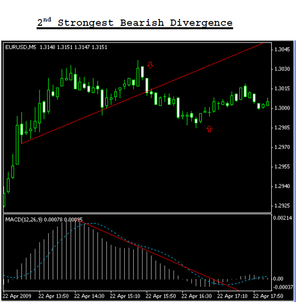
Strongest Bearish Divergences
MACD divergences generally indicate that a major reversal is about to occur but they do not happen at every major top or bottom.A strong bearish divergence is where prices reach a new high but the MACD histogram makes a lower top. This shows that the bulls are becoming weak. To trade this you should go short when the MACD histogram ticks down after its second top (the lower top) when prices are at a new high. Your stop loss should be placed above the most recent high in prices.
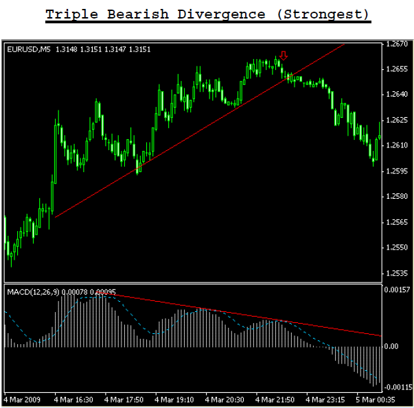
If you get stopped out because prices go beyond the latest high, look for a Triple Bearish Divergence.These signals are even stronger than normal divergences. They are identified by three price peaks and three indicator tops. Go short when the MACD histogram ticks down after its third top (the lowest top) when prices are at a new high.
Again, you should place your protective stop above the most recent and highest high in prices.
As was said earlier — the new downtrend in prices is confirmed if prices keep dropping to new lows and the MACD histogram continues to go lower at the same time.
To Read more,Please download the book.
Source:WizardTrader
Download Killer Patterns, forex bonus without deposit, Forex Broker, forex broker bonus, forex learn, forex learning, forex learning pdf, forex tutorials for beginners pdf, how to trade forex for beginners pdf, Killer Patterns, Killer Patterns pdf, learning forex trading pdf, MACD, MACD histogram ticks, PDF Killer Patterns
Similar Videos and E-books


LEAVE A COMMENT
All Books
For Beginners
- Candlesticks For Support And Resistance
- Online Trading Courses
- Commodity Futures Trading for Beginners
- Hidden Divergence
- Peaks and Troughs
- Reverse Divergences And Momentum
- Strategy:10
- The NYSE Tick Index And Candlesticks
- Trend Determination
- The Original Turtle Trading Rules
- Introduction to Forex
- The Six Forces of Forex
- Study Book for Successful Foreign Exchange Dealing
- Forex. On-Line Manual for Successful Trading
- 18 Trading Champions Share Their Keys to Top Trading Profits
- The Way to Trade Forex
- The Truth About Fibonacci Trading
- Quick Guide to Forex Trading
- Chart Patterns and Technical Indicators
- Forex Trading
- Trading Forex: What Investors Need to Know
- My Dog Ate My Forex
- Point & Figure for Forex
Forex Market in General
- Screen Information, Trader Activity, and Bid-Ask Spreads in a Limit Order Market
- Strategic experimentation in a dealership market
- Limit Orders, Depth, and Volatility
- Reminiscences of a Stock Operator
- Market Profile Basics
- Quote Setting and Price Formation in an Order Driven Market
- Phantom of the Pits
- An Introduction to Market Profile and a Users Guide to Capital Flow Software
- The Effect of Tick Size on Volatility, Trader Behavior, and Market Quality
- Trading as a Business
- What Moves the Currency Market?
- Macroeconomic Implications of the Beliefs and Behavior of Foreign Exchange Traders
- All About the Foreign Exchange Market in the United States
Psychology of Trading
- A Course in Miracles
- Thoughts on Trading
- Calming The Mind So That Body Can Perform
- Lifestyles of the Rich and Pipped
- The Miracle of Discipline
- Zoom in on Personal Trading Behavior And Profit from It
- The Woodchuck and the Possum
- 25 Rules Of Forex Trading Discipline
- Stop Losses Are For Sissies
- Your Personality and Successful Trading
- Trading as a Business
- The 7 Deadly Sins of Forex (and How to Avoid Them)
- The 5 Steps to Becoming a Trader
Money Management
- Risk Control and Money Management
- Money Management
- Position-sizing Effects on Trader Performance: An experimental analysis
- Fine-Tuning Your Money Management System
- Money Management: Controlling Risk and Capturing Profits
- Money Management Strategies for Serious Traders
- The Truth About Money Management
- Money Management and Risk Management
Forex Strategy
- 1-2-3 System
- Bollinger Bandit Trading Strategy
- Value Area
- The Dynamic Breakout II Strategy
- Ghost Trader Trading Strategy
- King Keltner Trading Strategy
- Scalp Trading Methods
- LSS - An Introduction to the 3-Day Cycle Method
- Market Turns And Continuation Moves With The Tick Index
- The Money Manager Trading Strategy
- Picking Tops And Bottoms With The Tick Index
- The Super Combo Day Trading Strategy
- The Eleven Elliott Wave Patterns
- The Thermostat Trading Strategy
- Intraday trading with the TICK
- Traders Trick Entry
- Fibonacci Trader Journal
- Rapid Forex
- Microtrading the 1 Minute Chart
- BunnyGirl Forex Trading Strategy Rules and FAQ
- The Daily Fozzy Method
- Forex Traders Cheat Sheet
- Offset Trading
- How to Trade Both Trend and Range Markets by Single Strategy?
- A Practical Guide to Technical Indicators; Moving Averages
- FX Wizard
- FX Destroyer
- A Practical Guide to Swing Trading
- Practical Fibonacci Methods for Forex Trading
- Using The Heikin-Ashi Technique
- The Day Trade Forex System
- 5/13/62
- Not So Squeezy Trading Manual
- KobasFX Strategy
- Killer Patterns
- 3D Trading
- 4 Hour MACD Forex Strategy
- WRB Analysis Tutorial
Advanced Forex Trading
- A New Interpretation of Information Rate
- CCI Manual
- Nicktrader and Jeff Explaining Reverse and Regular Divers
- NickTrader on No Price CCI Divergence Trading
- Are Supply and Demand Driving Stock Prices?
- The Sharpe Ratio
- The Interaction Between the Frequency of Market Quotes, Spread and Volatility in Forex
- Trend Determination
- Trend vs. No Trend
- A Six-Part Study Guide to Market Profile
- How George Soros Knows What He Knows
- Core Point and Figure Chart Patterns
- Coders Guru Full Course
- Point and Figure Charting: a Computational Methodology and Trading Rule Performance in the S&P 500 Futures Market
- Evolving Chart Pattern Sensitive Neural Network Based Forex Trading Agents
- Heisenberg Uncertainty Principle and Economic Analogues of Basic Physical Quantities
- The String Prediction Models as an Invariants of Time Series in Forex Market
- Using Recurrent Neural Networks to Forecasting of Forex
- The New Elliott Wave Rule - Achieve Definitive Wave Counts